Scan&Go in Retail: Which Features Actually Improve the Shopping Experience
Long checkout lines can ruin the impression of even a strong retail brand. A customer may already have chosen the products, moved through the store, and reached the final step of the journey, only to face delay right before payment. For retailers, this is no longer a minor inconvenience. It affects repeat visits, store throughput, and pressure on checkout zones during peak hours.
That is why Scan&Go is no longer seen as an experimental digital extra. It has become a practical format for brick-and-mortar retail. When implemented correctly, it helps reduce friction at the exact point where frustration usually peaks: the end of the purchase.
Why Scan&Go matters in modern retail
Scan&Go is a mobile self-checkout flow in which shoppers scan items on their phones while moving through the store, build a digital cart, and complete payment without going through a traditional checkout process. In its strongest form, this is not just a scanning feature. It is a full purchase flow inside one app experience.
For retailers, the value is easy to understand. Some of the checkout load moves away from staffed lanes and self-checkout hardware. For shoppers, the benefit is even clearer: less waiting, fewer steps, and a smoother finish to the store visit.
As retail competition becomes more tied to convenience, speed, and customer comfort, that final stage of the journey matters more than ever. Price and assortment still matter, but convenience increasingly shapes loyalty.
Why Scan&Go should be treated as a practical solution, not a trend
Retail technology often looks promising in theory. The real question is whether it removes friction in a live store environment. Scan&Go only works when it makes the purchase easier in a way the customer can feel immediately.
That is what separates a useful product from a feature that sounds good in a presentation but adds little value in practice. If the app is slow, confusing, or forces extra steps, the promise collapses quickly. If the experience is simple and reliable, the impact becomes visible in store operations and repeat usage.
A strong Scan&Go product does not try to impress with complexity. It reduces effort. It shortens the path from shelf to payment. It makes the final step of shopping feel lighter instead of heavier.
Which Scan&Go features actually improve the shopping experience
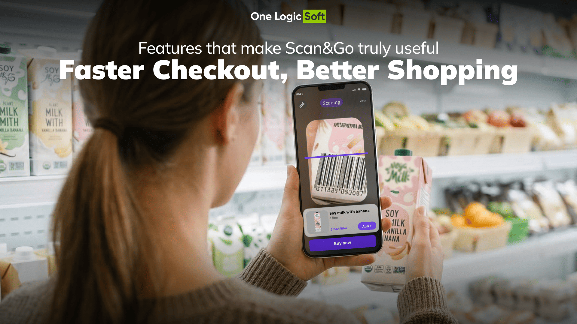
Fast and reliable scanning
Everything starts with scanning. If barcode recognition is slow, unstable, or unclear, trust drops within seconds. The shopper should never wonder whether the item was added, whether the camera is working correctly, or whether they need to repeat the action.
A strong Scan&Go flow usually includes:
- quick access to the scanner
- stable barcode recognition
- instant confirmation after each scan
- easy quantity adjustment
- fast item removal from the cart
These are not minor interface details. They define whether the experience feels smooth or frustrating.
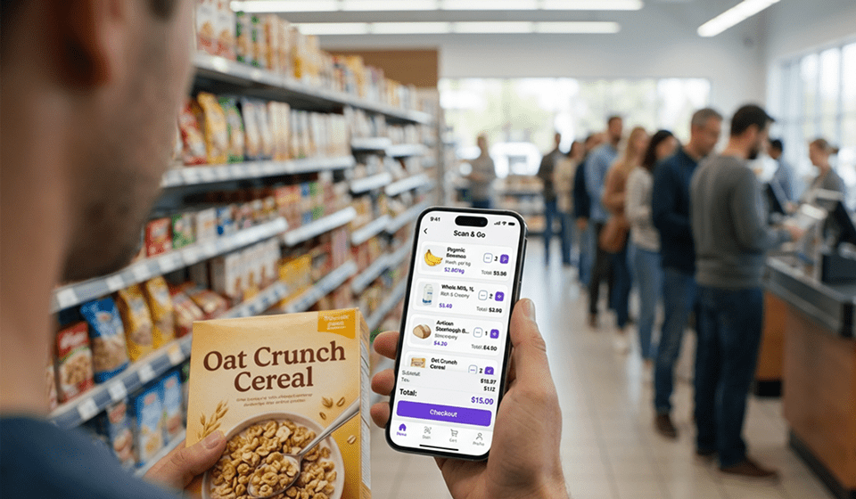
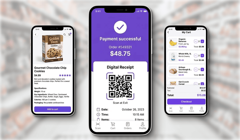
A clear and usable digital cart
After scanning, the shopper should immediately see the result. The digital cart is not there for formality. It is there to create confidence and control. People want to know what has already been added, what the current total is, and what happens next.
When the cart is simple, visible, and easy to edit, the whole purchase feels more predictable. That reduces hesitation before payment and lowers the chance of abandonment.
In-app payment
One of the biggest strengths of Scan&Go is the ability to complete payment inside the same flow. If the customer scans items in one place and then has to switch into a different process to pay, part of the convenience disappears.
A stronger model keeps the entire purchase journey connected: scan, review, pay, confirm. That continuity matters. It turns the app from a helper into a full checkout experience.
An interface designed for real store conditions
A shopper using Scan&Go is not sitting comfortably at a desk. They are walking through aisles, holding products, checking shelves, making decisions in motion, and often shopping under time pressure. Because of that, the interface has to be extremely clear.
Buttons have to be obvious. The next step has to be easy to understand. Errors have to be visible and easy to fix. Anything that creates doubt or forces extra thought weakens adoption.
In retail, usability is not a design preference. It is part of operational success.
Personalized offers that do not interrupt the core flow
Retail apps often try to combine convenience with loyalty features, promotions, and recommendations. That makes sense, but only when the main purchase flow stays clean.
Promotions should support the experience, not interrupt it. If offers, banners, or notifications distract the customer during scanning or payment, the app becomes heavier and less pleasant to use. The core flow has to stay primary. Loyalty features should remain secondary.
What real-world implementation shows
The practical value of Scan&Go becomes much clearer when the discussion moves from theory to implementation. In retail, the result depends on how the product is built around real operational pressure: peak-hour traffic, limited checkout capacity, shopper impatience, and the need to keep the process intuitive.
That connection between business problem, product design, and measurable outcome is exactly what matters in live store environments.
At One Logic Soft, we applied this approach in our Scan&Go Mobile Self-Checkout Case Study for a European supermarket chain. The goal was straightforward: improve the in-store purchase experience during busy periods, when the standard checkout model was no longer handling customer flow efficiently enough.
How One Logic Soft approached the Scan&Go product
The product logic behind the MVP
The solution was built around a mobile scan – cart – pay flow. Shoppers could scan products in the store, manage a digital cart, and complete the purchase inside the app. That structure was important because it reduced unnecessary actions at the final stage of shopping.
For the MVP, we focused on the features that directly affect real in-store usage:
- fast QR and barcode scanning
- simple digital cart management
- in-app payment
- an interface suitable for use on the move
- readiness for multi-store scaling
- localization for different markets
- personalized offers and loyalty mechanics inside the app
This set of features matters because it shapes the real customer journey. Shoppers are rarely willing to tolerate confusion when they are already near the end of a purchase. In that moment, speed and clarity matter more than extra functionality.
Why this approach works in retail
Retail teams usually do not need another digital feature for its own sake. They need a working flow that helps reduce pressure on checkout operations without making the customer work harder.
That is where Scan&Go becomes valuable. When the app lets shoppers scan quickly, see the cart immediately, pay without delay, and leave with a clear confirmation, it starts solving an actual store problem.
In our case, that product logic created the foundation for:
- shorter queues during peak hours
- less dependence on costly self-checkout hardware
- a more convenient contactless purchase flow
- fewer complaints linked to checkout friction
- stronger engagement through loyalty and personalization
- future rollout across more locations and regions
For retailers, that changes the role of Scan&Go completely. It stops being an interesting app feature and becomes a practical operating tool.
Which Scan&Go features create business value
| Business goal | App feature | Practical effect |
| Reduce checkout pressure | Fast scanning and in-app payment | Part of customer flow moves away from traditional lanes |
| Make purchases faster | Simple cart and short checkout flow | Fewer unnecessary actions at the final stage |
| Improve convenience | Clear interface and visible purchase confirmation | Less confusion and easier repeat use |
| Increase retention | Offers, reminders, loyalty elements | The app becomes a repeat engagement channel |
| Support scaling | Architecture built for multi-store rollout | The solution can grow beyond a local pilot |
What retailers should take from this
The main lesson is simple. Scan&Go works when it removes friction in a real store, not when it exists as a feature on a roadmap. The quality of the user flow matters more than the novelty of the idea.
Retailers usually see the strongest value when the product does four things well:
- scans items quickly and consistently
- shows a clear and editable cart
- keeps payment inside the same flow
- stays easy to use in a busy store environment
Everything else should support those basics, not compete with them.
Conclusion
Scan&Go delivers value when it improves the full shopping path inside the app, not when it simply adds another digital layer to the store. When the solution shortens queues, reduces friction, speeds up payment, and stays ready for scaling, it becomes a practical retail tool with clear business value.
At One Logic Soft, we design and deliver mobile self-checkout solutions shaped by the realities of in-store retail – peak-hour pressure, checkout bottlenecks, operational limits, and the need for a smooth customer experience. See our Scan&Go Mobile Self-Checkout Case Study for a practical example of this approach, or browse our Case Studies section to discover more retail and product development work.
Have a project in mind?
Let's chat
Your request has been accepted!
In the near future, our manager will contact you.
Have a project to discuss?

Have a partnership in mind?