How UI and UX Impact Ecommerce Metrics and Revenue
What UI and UX Actually Mean in an Online Store
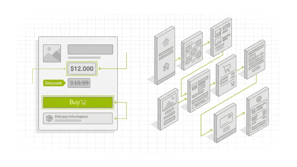
UI
UI (User Interface) is the visual layer that helps a shopper understand what’s happening on the page and what to do next, within seconds.
UI in ecommerce includes
- Visual hierarchy: what’s seen first, where the price is, where the value is, where the CTA is
- Contrast and readability: fonts, spacing, line length, clear labels
- Element states: is the button active, is it loading, what happens after a click
- Price and discount clarity: final price, savings, promo terms without ambiguity
- Delivery and returns presentation: short, clear, easy to find, written like a human
UX
UX (User Experience) is the purchase journey and the logic behind the steps: how people search, choose, validate conditions, place an order, pay, get confirmation, and come back.
UX in ecommerce includes
- Search and selection: catalog, filters, sorting, comparison, wishlist
- Removing doubts: delivery, returns, warranties, stock, timelines
- Checkout flow: cart, checkout, payment, confirmation, order status
- Repeat purchases: account area, fast reorders, recommendations, order history
In ecommerce, people often act on autopilot while multitasking. UX either speeds up the path or introduces pauses and mistakes that cut conversion.
The Metrics That Depend on UI and UX
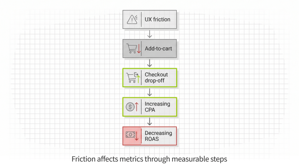
UI and UX affect revenue through measurable steps inside the funnel. In analytics, that usually shows up in:
- Funnel performance: purchase conversion rate, add-to-cart rate, cart abandonment, checkout drop-off
- Paid efficiency: CPA/CAC, ROAS (through conversion and landing page behavior)
- Commercial outcomes: AOV, repeat purchase rate
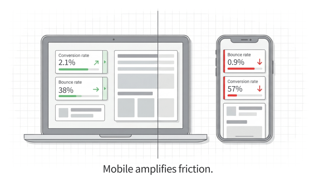
- Device impact: mobile bounce rate, mobile conversion gap vs desktop
Key takeaway: metrics typically change due to friction points, not design preference. Friction can be located in data, confirmed by user behavior, and removed with specific fixes.
Funnel Map: Where Ecommerce Typically Loses Money
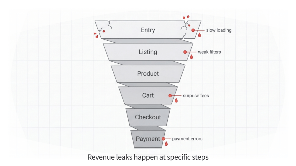
Most ecommerce issues are not “everywhere”. They concentrate in one step where shoppers hesitate, cannot choose, cannot validate terms, or hit a technical blocker.
A typical ecommerce funnel
- Entry (ads, organic, direct)
- Category and listing (collections, results, sorting)
- Product page
- Cart
- Checkout
- Payment
- Post-purchase (email, status, tracking, returns, reorders)
What usually breaks at each step
Entry: slow loading, mismatch between ad promise and landing page, unclear first screen
Listing: weak filters, unhelpful default sorting, product tiles that do not support quick choice
Product page: missing answers, unclear delivery/returns, weak value clarity
Cart and checkout: surprise fees, long forms, unclear errors, forced account creation
Payment: trust gaps, payment failures, weak confirmation
Post-purchase: unclear status and tracking, hard reorders, confusing returns flow
The business effect is simple: UI and UX move metrics by shortening the chain and reducing “stops” that lead to drop-off.
Case Reference: Könner & Söhnen. Multi-Market Shopify Plus Ecosystem
In multi-market ecommerce, revenue loss often does not start at checkout. It begins earlier in inconsistent catalog structures, fragmented pricing rules, duplicated localization logic, and unstable regional workflows.
Könner & Söhnen, a European manufacturer operating across multiple EU markets, faced exactly this challenge. As the number of regions, distributors, and product variations grew, the existing store setup became harder to manage. Pricing differed by country, localization structures drifted, and SKU logic for B2B partners increased operational complexity.
The problem was not visual. It was structural.
One Logic Soft rebuilt the platform as a unified Shopify Plus multi-store ecosystem, designed to maintain consistency across markets while supporting both B2C storefronts and B2B workflows.
The solution included:
- Six regional stores managed under one ecosystem
- Eleven language configurations with consistent structure
- Shared pricing and inventory rules across markets
- A custom B2B portal with role-based access and customer-specific pricing
- Automation via a self-hosted n8n server for product and price synchronization
- SEO-safe migration with structured redirects and content mapping
- 360-degree product views to enhance product presentation
Instead of each region evolving separately, shared rules were enforced across the system. Localization, pricing, inventory, and partner access followed consistent logic.
Business impact included:
- Stable multi-market operations without duplicating work
- Reduced manual coordination and fewer pricing errors
- Cleaner B2C + B2B user journeys
- Preserved SEO equity during migration
- A scalable foundation for further international expansion
This project illustrates a key ecommerce principle:
UX is not only about buttons and forms. It includes how product data is structured, how localization is handled, how pricing rules are applied, and how migration protects traffic.
When structural UX is inconsistent, funnel leakage appears long before checkout. When architecture is unified, conversion becomes stable across regions.
Cart and Checkout: Where Ready Orders Disappear
By the time a shopper reaches checkout, the decision is mostly made. At this stage, the store wins by delivering a predictable finish with no surprises.
What reduces payment conversion
- Extra charges appear late: shipping, taxes, fees revealed at the end
- Long forms: unnecessary fields, no autofill, unclear hints
- Forced registration: account required before payment
- Unhelpful validation: errors that do not explain what to fix
- Weak step structure: unclear progress, back button loses entered data
What to track in analytics
- Checkout drop-off by step
- Time per step
- Validation errors by field
- Backtracking events
- Payment retries and failure rate
Fixes that often deliver fast lift
- Show a realistic total earlier: shipping and taxes before heavy input
- Default to guest checkout: offer account creation after purchase
- Shorten forms: minimum fields, autofill, phone masks, address helpers
- Make errors specific: field, issue, example of a correct format
- Make progress readable: clear steps, safe back navigation, no data loss
Case Reference: Scan&Go Mobile Self-Checkout MVP

A practical example of checkout optimization beyond traditional ecommerce is the Scan&Go mobile self-checkout MVP delivered for a European supermarket chain.
The core business problem was clear: peak-hour queues were increasing customer complaints, slowing throughput, and forcing the retailer to consider additional staff or expensive self-checkout hardware. The objective was not visual redesign. It was to shorten the completion path.
The solution focused on a single, uninterrupted flow:
Scan → Cart → Pay
Customers scan items directly in the aisle, build a digital cart in real time, and complete payment inside the app without switching context. The UX principles applied were the same as in high-performing ecommerce checkouts:
- Minimal number of screens
- No redundant confirmations
- Clear cart visibility at all times
- Fast in-app payment
- Stable interaction under real store conditions
- Loyalty and personalized offers integrated without interrupting checkout
Instead of adding features, the flow was simplified to reduce friction in the final stage of purchase.
Business impact included:
- Reduced peak-hour checkout lines
- Fewer complaints related to wait time
- Lower dependence on additional cashier lanes and hardware
- Smoother contactless experience
- Higher engagement through loyalty programs and personalized offers
- A scalable mobile-first foundation for expansion across stores and regions
The logic is identical to ecommerce checkout optimization. When the final steps are predictable and fast, completion rates improve. When they introduce hesitation, even ready buyers abandon.
This case illustrates a broader principle: UX is not decoration. It is throughput.
Mobile: Where Stores Often Lose Paid Traffic Money
Mobile brings volume, but buying is harder: smaller screens, fragmented attention, less stable connections. Weak mobile UX turns ad clicks into exits before cart.
Typical causes of weak mobile conversion
- Small tap targets: misclicks and frustration
- Overlays block actions: popups or sticky elements cover content and CTAs
- Filters behave poorly: hidden, reset after back, hard to apply
- Performance issues: slow load, lag, layout shifts
- Hard scanning: small text and weak contrast
What to track
- Mobile bounce rate
- Speed on key templates: listing, product page, checkout
- Conversion rate by device
- Mobile add-to-cart rate
- Mobile form errors: address, phone, postal code
Speed: A UX Factor That Breaks the Funnel Before Choice Happens
Speed changes behavior before a shopper sees the offer clearly. Slow pages cause exits, reduce product exploration, and weaken paid campaign performance.
What to check first
- Paid landing pages
- Category and listing pages
- Product pages
- Cart and checkout
- Search and filtering interactions
A practical approach is to focus on the templates that receive the highest traffic and the highest commercial intent, then measure before and after.
Search and Filters: Where Choice Breaks and AOV Drops
A lot of purchases start with comparison. When search and filters reflect internal inventory logic instead of customer language, shoppers fail to find what they want and leave.
What commonly hurts selection
- Filters reflect internal taxonomy, not customer intent
- Too many parameters without clear priorities
- Default sorting does not match the shopper’s goal
- Search does not handle typos and close synonyms
- Zero-results pages provide no recovery path
Metrics that suffer
- Search results CTR
- Zero-results share
- Listing-to-product click-through
- Add-to-cart rate
- AOV when comparison and upsell paths fail
Trust as a UX Layer That Decides Payment
Buying online includes risk. UX reduces risk through clarity: what happens after payment, when delivery happens, how returns work, where support is, and who is responsible.
Common trust gaps
- Delivery and returns are hidden or written in legal language
- Support feels absent or vague on response time
- Reviews exist but do not answer decision questions
- Payment confirmation is weak or ambiguous
- There is no clear “what’s next” after purchase
What to track
- Payment step conversion
- Clicks on delivery and returns, then next user actions
- Repeat pre-purchase questions to support
- Cancellations and returns triggered by unexpected conditions
How UI and UX Affect CPA and ROAS in Paid Ads
Ads drive sessions, revenue happens after payment. Weak UX turns budget into leakage:
- fewer users reach product pages
- selection is unclear, add-to-cart drops
- fees appear late, abandonment grows
- mobile forms fail, CPA rises
- landing pages load slowly, bounce increases, ROAS drops
A practical way to measure impact
- Write each UI or UX change as a hypothesis tied to a metric
- Track release date and affected templates
- Measure outcomes by:
- channel
- device
- landing page group
- channel
- Compare like with like: new vs returning, mobile vs desktop, paid vs organic
Symptom-Based Diagnosis: What to Fix First
| Symptom | Where to check | Likely cause | Typical fix |
| Traffic grows, sales stay flat | conversion by device and channel, landing speed, path to product page | landing mismatch, weak first screen, slow load | strengthen first screen, shorten path to products, improve speed |
| High cart abandonment | checkout steps, fee visibility, registration, form errors | late fees, long forms, payment friction | show total earlier, guest checkout, shorten fields, improve errors |
| Mobile conversion far below desktop | tap targets, overlays, readability, speed on listing and checkout | small elements, CTA blocked, lag, form failures | increase tap sizes, remove blockers, speed up templates, simplify forms |
| Many zero search results | query logs, zero-results rate, search CTR | search does not match customer language | add synonyms, typo handling, better suggestions, recovery paths |
| Many pre-purchase support questions | delivery and returns clicks, product page content, contact visibility | terms unclear, low confidence after payment | make terms visible, improve trust blocks, clarify post-payment steps |
When a UI/UX Audit Delivers More Than a Redesign
A redesign changes visuals. An audit identifies why money is lost and ranks fixes by impact.
Signs an audit will outperform a redesign
- Traffic is rising but revenue is not
- Abandonment is high, the drop is specifically in checkout
- Mobile conversion is significantly lower than desktop
- Listing, product, or checkout pages load slowly
- CPA rises while campaigns stay stable
- Support gets the same questions before purchase
What a Metric-Driven Ecommerce UI and UX Audit Includes
A strong audit ends with an implementation plan, not opinions.
What is analyzed
- Purchase path: entry, catalog or search, product page, cart, checkout
- Mobile scenarios: tapping, readability, overlays, filter behavior
- Checkout: steps, forms, guest checkout, errors, total clarity
- Trust layer: delivery, returns, contacts, reviews, payment confirmation
- Speed and stability on key pages
- Prioritization by impact and effort
What the business gets
- A list of loss points tied to metrics
- A prioritized backlog of fixes
- Definition of done for design, development, and content
- A measurement plan: reports, segments, comparison windows
FAQ
Are UI and UX the same thing
No. UI is about visual clarity and readability. UX is about journey logic and task completion. In ecommerce, UI helps users understand the offer fast, UX helps them buy fast.
What matters more for sales, UI or UX
Most of the time, UX. If search, checkout, or payment breaks, visuals will not rescue revenue. UI becomes critical when attention is limited, especially on mobile.
Can you improve conversion without a redesign
Yes. Many wins come from targeted changes: early total clarity, guest checkout, fewer fields, autofill, better error messaging, reordering product page blocks, simpler filters.
Which pages often deliver the fastest impact
- Checkout and cart
- Product page
- Catalog, search, and filters
- Paid landing pages
Ecommerce Conversion Research → UI/UX Audit
This article is based on practical funnel diagnostics from real ecommerce delivery – from multi-market Shopify Plus ecosystems to mobile-first retail checkout applications.
If the friction patterns described here feel familiar, the next step is not a redesign. It is a structured audit tied to measurable metrics.
Share Your Store. Get a UI/UX Conversion Audit.
At One Logic Soft, we run a metric-driven UI/UX audit focused on revenue outcomes: conversion lift, lower CPA, stronger ROAS, and fewer drop-offs across the purchase path.
What we analyze
- Entry and landing page alignment with traffic sources
- Catalog structure, filters, sorting, and product discovery
- Product page clarity, decision support, and trust signals
- Cart and checkout flow, forms, fees, and error handling
- Mobile friction points and device-specific behavior gaps
- Speed, template stability, and performance bottlenecks
- Structural UX issues in multi-market and B2B workflows
What you receive
- Revenue leakage map tied to funnel metrics and user behavior signals
- Prioritized fix list ranked by impact and effort, ready for implementation
- Actionable guidance for design, development, and content updates
- Measurement framework to validate results across conversion, CPA, ROAS, and key segments
If traffic is stable but revenue growth has slowed, the cause is often inside the funnel.
You can also review our Retail & eCommerce Case Studies to see how we’ve built Shopify Plus ecosystems and mobile-first checkout flows for European businesses.
Send us your store URL and your main KPI target (conversion rate, CPA, ROAS, AOV, repeat purchase rate). We will reply with an audit scope, timeline, and deliverables tailored to your business model.
Let’s discuss your project.
Have a project in mind?
Let's chat
Your request has been accepted!
In the near future, our manager will contact you.
Have a project to discuss?

Have a partnership in mind?